UX & UI
Design

UX & UI

Teaser
UX Design Showreel Teaser. Full version coming soon (maybe).
Music by Thismanslife - "Give Me Contrast"


Steven Webster presenting "Re-thinking Advertising" at the Adobe offices in San Francisco for Design Authority. The work shown was created by myself and others on the Microsoft Experience Design team. As well as showcasing some of our design work, more broadly this serves as an example of the thinking and work I was involved in as part of the team and how we applied design-thinking to re-frame advertising.
Segments of my work:
11:40 – Travel booking
16:05 – Car breakdown

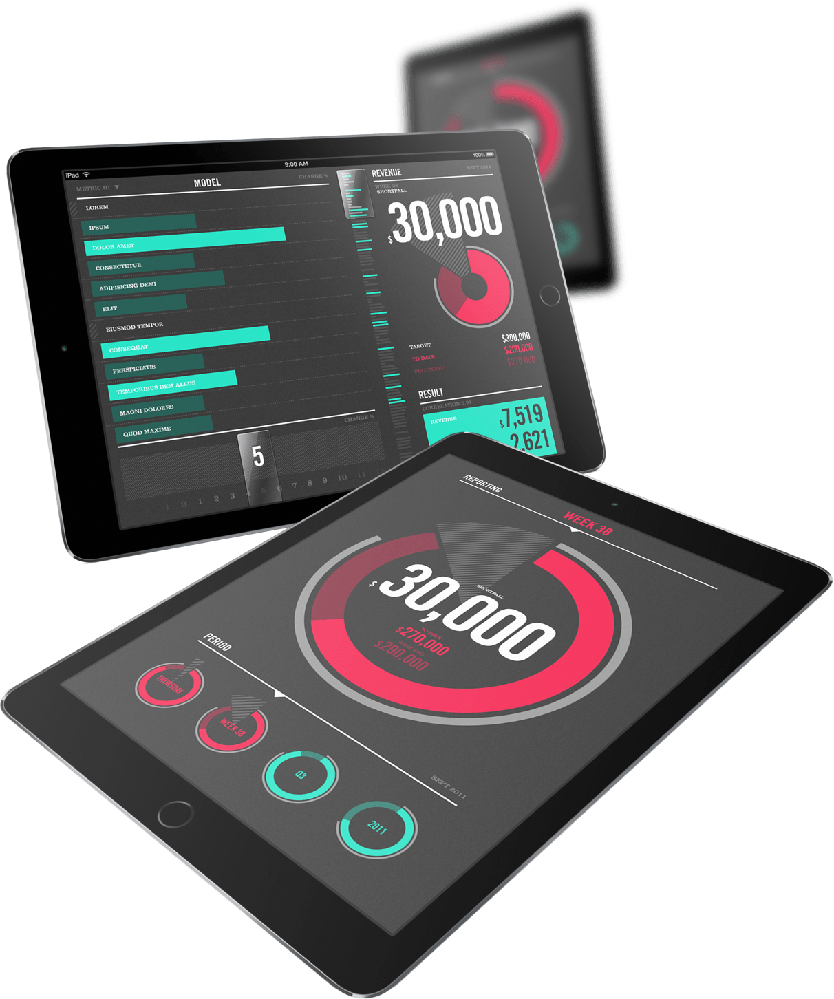


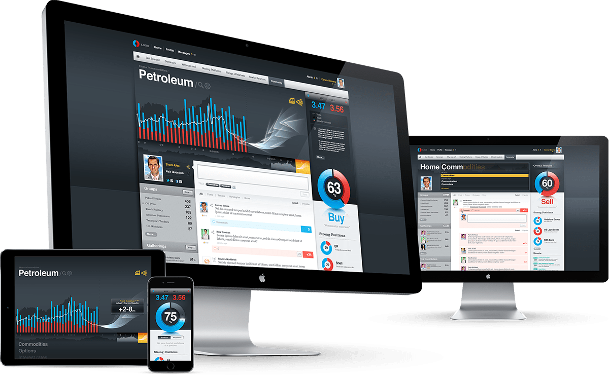

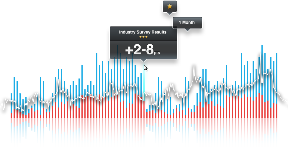


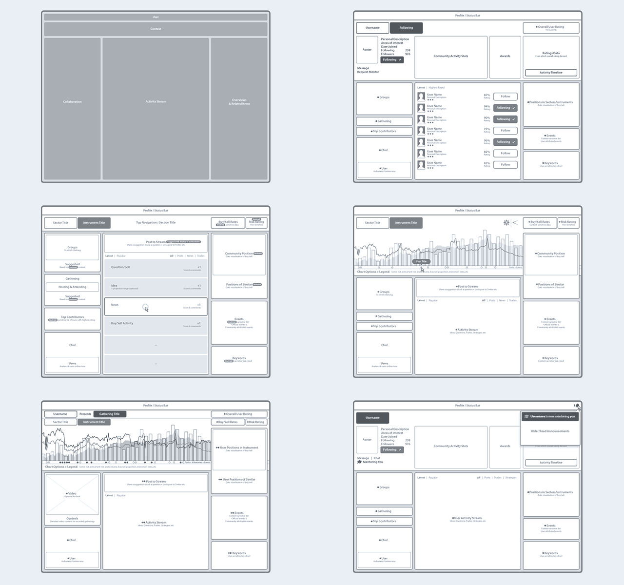
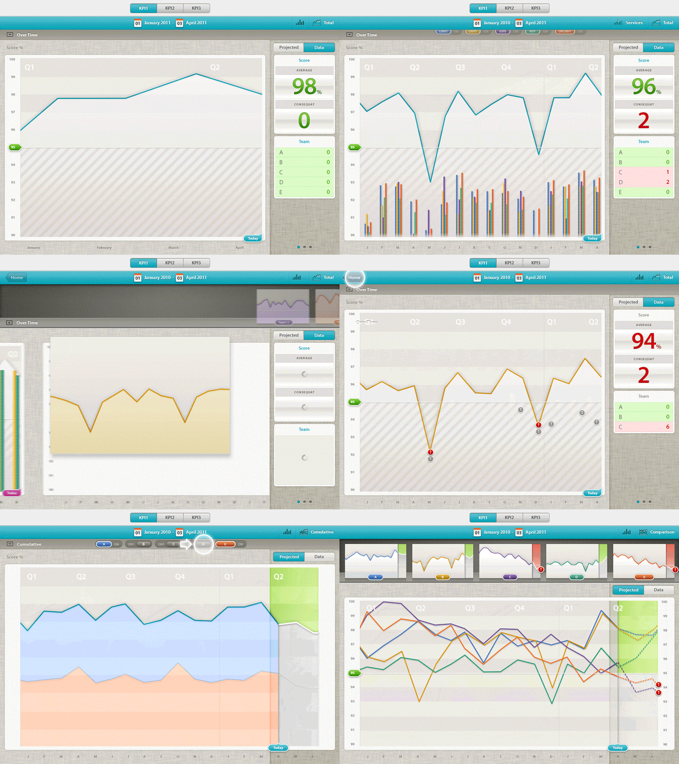
Sequenced visuals of a data visualisation explorer illustrating interations, transitions and overall experience flow across key states of the interface.
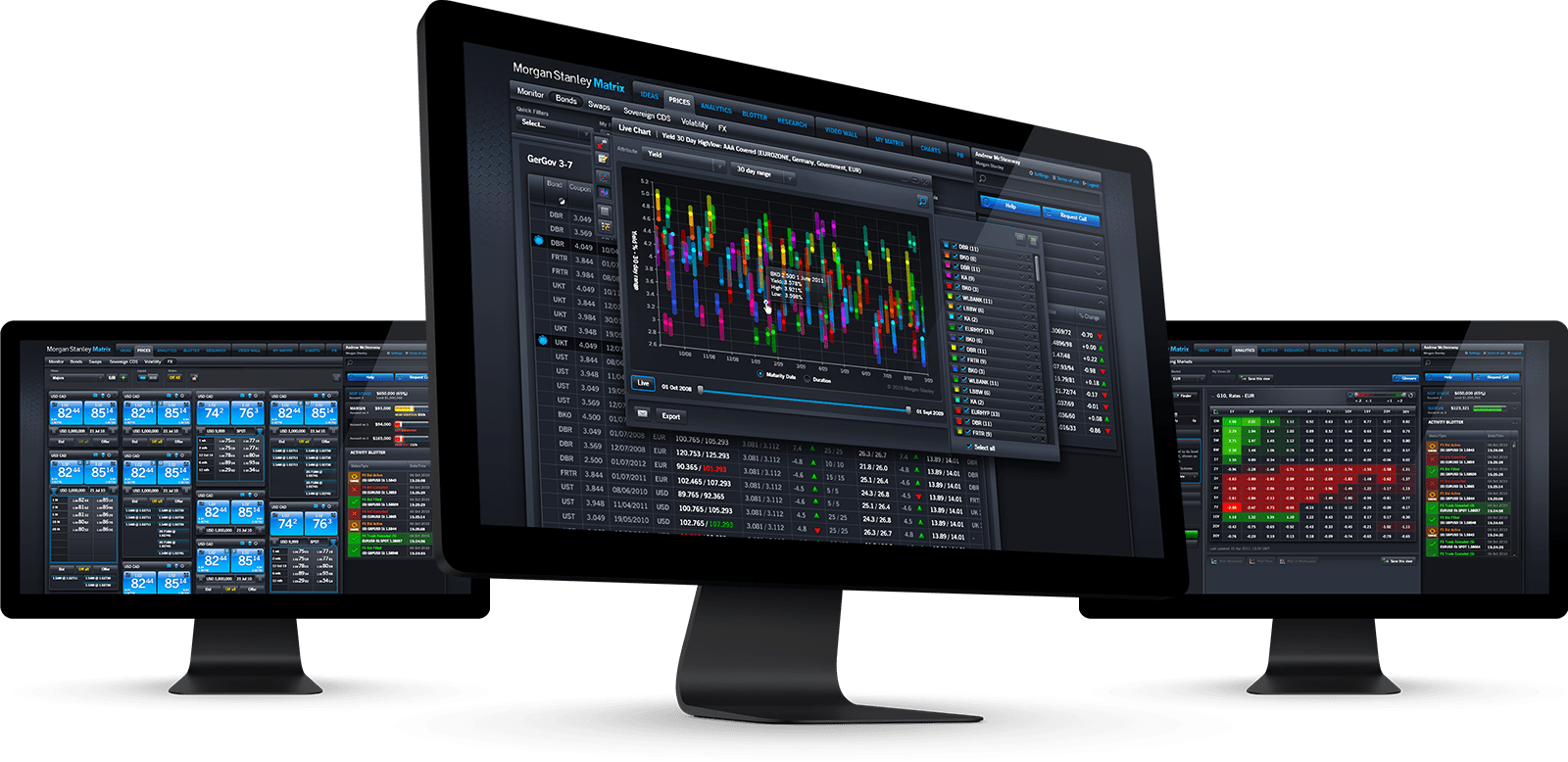
Matrix is Morgan Stanley’s Fixed Income trading platform, providing their clients with access to live streaming prices, research, trade ideas and commentaries, analytics tools and the ability to trade directly from their desktops - all in a single, integrated application.
Working on-site at their offices in Canary Wharf, London, I was part of the original team who defined the UX and personally created the visual design of the UI.
During my 2+ years on the project, I co-led the UX team and worked hands-on as an interface designer. I defined and owned the visual design, interaction patterns, and the overall experience of the application. It was a privilage to work with a fantastic, talented team, and am proud to have been part of building a multiple award winning application, one of the largest Adobe Flex projects ever undertaken.
Demo application I designed in 2007 at Adobe to showcase ideas for reimagining online banking. I created the visual design of the application UI, as well as working with talented IA Richard Toplis on initial concepts & ideas. I personally defined the visual style, choreography (animation), interactions and ultimately my role was overall hands-on production of visuals. The demo was built by the genius Jérôme Cordiez.
This video which shows a walk through of the entire demo was produced and published by Adobe evangelist, Michaël Chaize. More of Michaël's videos are available, including an English language video of this UI, which also demonstrates a mobile version of the application. However, I was only responsible for the design of the desktop scale interface.
For lack of a better title











All iPhone + Instagram
Loading
A bit on the side
www.thismanslife.co.uk has been online since the turn of the century. Scroll back in time, revisiting the history of its evolution, and reminisce about how web design (and monitors) evolved over the last 20+ years.

So you need a video to fit in your responsive layout but don't know how to get it scaling in proportion? This simple tool calculates an intrinsic ratio and generates code to make your videos scale responsively with simple CSS.
A simple interactive experiment with responsive design techniques. Each device illustration is rendered using the same basic HTML which adapts its appearance to the changing viewport size.
A simple interactive experiment with responsive design techniques and a call for new tooling.
Phiculator was a dashboard widget for Mac OSX, which given any number, calculated the corresponding number according to the golden ratio. Apple removed the dashboard feature from the Mac operating system in 2019, and as as such, Phiculator is only available for older systems.
Tinkering




Who is this man?

During my 5 years at Microsoft I was part of Studio 415/XD working on redacted before moving to the Office team to design a modernised and simplified UI for Office Online.
With extensive industry-spanning experience, I have broad practical abilities across the spectrum of design. From overall experience architecture to interaction details, I use design to frame problems, envisage solutions and translate ideas from concept into reality. I enjoy the exploration and definition of problems, conducting research, applying divergent thinking, envisioning ideas, testing with users, iterating, refining, and ultimately the hands-on craft of design production and delivery.
Working across desktop, mobile, web and beyond, my primary strengths are in visual design, interface design, interaction design, prototyping, and design systems. I also enjoy tinkering in code, tweaking nuances of animation and obsessing over details.
You should follow @thismanslife
I've used thismanslife as a URL and online pseudonym since the turn of the century, when I held this corner of the web for personal publishing, micro-blogging back before the days of Twitter 𝕏 and such. Over time it evolved into a place to publish personal work; design, illustration and photography.
Today, this site acts as both a portfolio and a digital dumping ground for things I make, photos I take and CSS rules I break.
An Englishman in Scotland, living beside the seaside with my family and our awesome dog. I like music, films and taking photos, mostly of the beach, my dog, or my dog on the beach.
I like getting emails
